Crafting Beautiful and Functional Buttons with React and Tailwind CSS
In the world of web development, buttons are the unsung heroes of user interaction. They are the gateways to actions, the triggers for functionality, and the visual cues that guide users through an application. A well-designed button can enhance user experience, improve accessibility, and contribute to a cohesive brand identity. Conversely, poorly designed buttons can lead to confusion, frustration, and a diminished sense of professionalism.
This article will guide you through the process of creating versatile and visually appealing buttons using two powerful technologies: React and Tailwind CSS. React’s component-based architecture makes it ideal for building reusable UI elements like buttons, while Tailwind CSS’s utility-first approach provides a rapid and flexible way to style them.
By the end of this guide, you’ll have a solid understanding of how to:
- Structure your React button component.
- Leverage Tailwind CSS for styling and customization.
- Implement various button states (hover, active, disabled).
- Create different button sizes and variants.
- Add icons to your buttons.
- Build accessible buttons.
Let’s dive in!
Setting Up Your Project
Before we start coding, ensure you have a React project set up with Tailwind CSS integrated. If you’re starting a new project, you can create one using Create React App and then follow the official Tailwind CSS installation guide for React.
Prerequisites
- Node.js and npm (or yarn) installed.
- A basic understanding of React components and JSX.
- Familiarity with CSS concepts.
Project Structure (Example)
A typical project structure might look like this:
my-react-app/
├── public/
├── src/
│   ├── components/
│   │   └── Button.js
│   ├── App.js
│   └── index.js
├── tailwind.config.js
├── postcss.config.js
└── package.json
We’ll focus on creating the Button.js component.
Building the Core Button Component
Our goal is to create a reusable Button component that accepts various props to control its appearance and behavior.
Basic Structure
Let’s start with a simple functional component that renders a <button> element.
// src/components/Button.js
import React from 'react';

const Button = ({ children, onClick, type = 'button', ...props }) => {
  return (
    <button type={type} onClick={onClick} {...props}>
      {children}
    </button>
  );
};

export default Button;
In this basic structure:
children: This prop will contain the content of the button (text, icons, etc.).onClick: A function to be executed when the button is clicked.type: The HTML button type (e.g., ‘button’, ‘submit’, ‘reset’). Defaults to ‘button’....props: This allows us to pass any other standard HTML button attributes (likedisabled,aria-label, etc.) to the underlying<button>element.
Adding Tailwind CSS Classes
Now, let’s start applying Tailwind CSS classes to style our button. We’ll add a base set of styles that will apply to all buttons.
// src/components/Button.js
import React from 'react';

const Button = ({ children, onClick, type = 'button', className = '', ...props }) => {
  const baseStyles = 'px-4 py-2 rounded-md font-semibold focus:outline-none focus:ring-2 focus:ring-offset-2';

  return (
    <button
      type={type}
      onClick={onClick}
      className={` ${baseStyles} ${className}`} // Combine base styles with custom classes
      {...props}
    >
      {children}
    </button>
  );
};

export default Button;
Let’s break down the baseStyles:
px-4 py-2: Adds horizontal and vertical padding.rounded-md: Applies medium rounded corners.font-semibold: Sets the font weight to semi-bold.focus:outline-none focus:ring-2 focus:ring-offset-2: These are crucial for accessibility. They remove the default browser outline and add a custom focus ring when the button is tabbed to.
Using the Button Component
Here’s how you might use this basic button in your App.js:
// src/App.js
import React from 'react';
import Button from './components/Button';

function App() {
  const handleClick = () => {
    alert('Button clicked!');
  };

  return (
    <div className="flex items-center justify-center min-h-screen bg-gray-100 p-4">
      <Button onClick={handleClick}>
        Click Me
      </Button>
    </div>
  );
}

export default App;
This will render a simple, uncolored button with basic padding and rounded corners.
Implementing Button Variants
Most applications require buttons with different visual styles to indicate their purpose (e.g., primary action, secondary action, destructive action). We can achieve this by introducing a variant prop.
Defining Variants
We’ll define a few common variants: primary, secondary, and danger.
// src/components/Button.js
import React from 'react';

const Button = ({ children, onClick, type = 'button', variant = 'primary', className = '', ...props }) => {
  const baseStyles = 'px-4 py-2 rounded-md font-semibold focus:outline-none focus:ring-2 focus:ring-offset-2';

  const variantStyles = {
    primary: 'bg-blue-500 hover:bg-blue-600 text-white focus:ring-blue-500',
    secondary: 'bg-gray-200 hover:bg-gray-300 text-gray-800 focus:ring-gray-500',
    danger: 'bg-red-500 hover:bg-red-600 text-white focus:ring-red-500',
  };

  return (
    <button
      type={type}
      onClick={onClick}
      className={` ${baseStyles} ${variantStyles[variant]} ${className}`}
      {...props}
    >
      {children}
    </button>
  );
};

export default Button;
Now, variantStyles is an object where keys are the variant names and values are the corresponding Tailwind CSS classes. We dynamically apply these classes based on the variant prop.
Using Variants
// src/App.js
import React from 'react';
import Button from './components/Button';

function App() {
  return (
    <div className="flex flex-col items-center justify-center min-h-screen bg-gray-100 p-4 space-y-4">
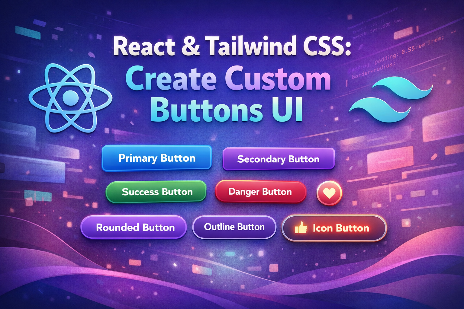
      <Button variant="primary">Primary Button</Button>
      <Button variant="secondary">Secondary Button</Button>
      <Button variant="danger">Danger Button</Button>
    </div>
  );
}

export default App;
This will render three distinct buttons, each with its own color scheme.
Implementing Button Sizes
Buttons also often need to come in different sizes to fit various contexts. We can introduce a size prop for this.
Defining Sizes
Let’s add small, medium, and large sizes.
// src/components/Button.js
import React from 'react';

const Button = ({ children, onClick, type = 'button', variant = 'primary', size = 'medium', className = '', ...props }) => {
  const baseStyles = 'font-semibold focus:outline-none focus:ring-2 focus:ring-offset-2';

  const variantStyles = {
    primary: 'bg-blue-500 hover:bg-blue-600 text-white focus:ring-blue-500',
    secondary: 'bg-gray-200 hover:bg-gray-300 text-gray-800 focus:ring-gray-500',
    danger: 'bg-red-500 hover:bg-red-600 text-white focus:ring-red-500',
  };

  const sizeStyles = {
    small: 'px-3 py-1 text-sm rounded',
    medium: 'px-4 py-2 rounded-md',
    large: 'px-6 py-3 text-lg rounded-lg',
  };

  return (
    <button
      type={type}
      onClick={onClick}
      className={` ${baseStyles} ${variantStyles[variant]} ${sizeStyles[size]} ${className}`}
      {...props}
    >
      {children}
    </button>
  );
};

export default Button;
We’ve added sizeStyles and incorporated it into the className string. Notice how the padding and text size change with each size.
Using Different Sizes
// src/App.js
import React from 'react';
import Button from './components/Button';

function App() {
  return (
    <div className="flex flex-col items-center justify-center min-h-screen bg-gray-100 p-4 space-y-4">
      <Button variant="primary" size="small">Small Button</Button>
      <Button variant="primary" size="medium">Medium Button</Button>
      <Button variant="primary" size="large">Large Button</Button>

      <div className="flex space-x-4">
        <Button variant="secondary" size="small">Small</Button>
        <Button variant="secondary" size="medium">Medium</Button>
        <Button variant="secondary" size="large">Large</Button>
      </div>
    </div>
  );
}

export default App;
This demonstrates how to easily control the button’s dimensions.
Handling Button States
Interactive elements need to provide visual feedback for different states, such as when the user hovers over them, clicks them, or when they are disabled.
Hover and Active States
Tailwind CSS makes handling hover and active states straightforward using pseudo-class variants. We’ve already included hover effects in our variantStyles. Let’s add an active state for a more tactile feel.
// src/components/Button.js
import React from 'react';

const Button = ({ children, onClick, type = 'button', variant = 'primary', size = 'medium', className = '', ...props }) => {
  const baseStyles = 'font-semibold focus:outline-none focus:ring-2 focus:ring-offset-2 transition duration-150 ease-in-out'; // Added transition

  const variantStyles = {
    primary: 'bg-blue-500 hover:bg-blue-600 active:bg-blue-700 text-white focus:ring-blue-500',
    secondary: 'bg-gray-200 hover:bg-gray-300 active:bg-gray-400 text-gray-800 focus:ring-gray-500',
    danger: 'bg-red-500 hover:bg-red-600 active:bg-red-700 text-white focus:ring-red-500',
  };

  const sizeStyles = {
    small: 'px-3 py-1 text-sm rounded',
    medium: 'px-4 py-2 rounded-md',
    large: 'px-6 py-3 text-lg rounded-lg',
  };

  return (
    <button
      type={type}
      onClick={onClick}
      className={` ${baseStyles} ${variantStyles[variant]} ${sizeStyles[size]} ${className}`}
      {...props}
    >
      {children}
    </button>
  );
};

export default Button;
We’ve added active:bg-... classes to each variant. We also added transition duration-150 ease-in-out to baseStyles for smoother visual transitions between states.
Disabled State
The disabled attribute on a button is essential for controlling user interaction. We can style the disabled state to provide clear visual cues.
// src/components/Button.js
import React from 'react';

const Button = ({ children, onClick, type = 'button', variant = 'primary', size = 'medium', disabled, className = '', ...props }) => {
  const baseStyles = 'font-semibold focus:outline-none focus:ring-2 focus:ring-offset-2 transition duration-150 ease-in-out';

  const variantStyles = {
    primary: 'bg-blue-500 hover:bg-blue-600 active:bg-blue-700 text-white focus:ring-blue-500',
    secondary: 'bg-gray-200 hover:bg-gray-300 active:bg-gray-400 text-gray-800 focus:ring-gray-500',
    danger: 'bg-red-500 hover:bg-red-600 active:bg-red-700 text-white focus:ring-red-500',
  };

  const sizeStyles = {
    small: 'px-3 py-1 text-sm rounded',
    medium: 'px-4 py-2 rounded-md',
    large: 'px-6 py-3 text-lg rounded-lg',
  };

  // Disabled styles
  const disabledStyles = 'opacity-50 cursor-not-allowed';

  // Combine all styles
  const allStyles = [
    baseStyles,
    variantStyles[variant],
    sizeStyles[size],
    disabled ? disabledStyles : '',
    className,
  ].join(' ');

  return (
    <button
      type={type}
      onClick={onClick}
      className={allStyles}
      disabled={disabled} // Pass the disabled prop to the button element
      {...props}
    >
      {children}
    </button>
  );
};

export default Button;
We’ve introduced disabledStyles and conditionally applied them. The cursor-not-allowed class visually indicates that the button is not interactive. We also pass the disabled prop directly to the HTML <button> element.
Using Disabled Buttons
// src/App.js
import React from 'react';
import Button from './components/Button';

function App() {
  return (
    <div className="flex flex-col items-center justify-center min-h-screen bg-gray-100 p-4 space-y-4">
      <Button variant="primary" disabled>Disabled Primary</Button>
      <Button variant="secondary" disabled>Disabled Secondary</Button>
      <Button variant="danger" disabled>Disabled Danger</Button>
    </div>
  );
}

export default App;
Adding Icons to Buttons
Icons can significantly improve the clarity and visual appeal of buttons. We can integrate icons by allowing them as children or by providing dedicated props. A common approach is to allow children to be a mix of text and an icon component.
Galaxy S26 Deal: Get $200 Off at Samsung Today
Best Pixel Phones 2026: Pixel 10, 10 Pro Fold, 10a Tested
How to Center a Div Using CSS Grid
Icon Integration
Let’s assume you’re using an icon library like react-icons.
First, install it:
npm install react-iconsor
yarn add react-icons
Now, modify the Button component to handle icons. We’ll add a prop for an icon and potentially adjust spacing if an icon is present.
// src/components/Button.js
import React from 'react';

const Button = ({ children, onClick, type = 'button', variant = 'primary', size = 'medium', disabled, icon: IconComponent, iconPosition = 'left', className = '', ...props }) => {
  const baseStyles = 'inline-flex items-center justify-center font-semibold focus:outline-none focus:ring-2 focus:ring-offset-2 transition duration-150 ease-in-out';

  const variantStyles = {
    primary: 'bg-blue-500 hover:bg-blue-600 active:bg-blue-700 text-white focus:ring-blue-500',
    secondary: 'bg-gray-200 hover:bg-gray-300 active:bg-gray-400 text-gray-800 focus:ring-gray-500',
    danger: 'bg-red-500 hover:bg-red-600 active:bg-red-700 text-white focus:ring-red-500',
  };

  const sizeStyles = {
    small: 'px-3 py-1 text-sm rounded',
    medium: 'px-4 py-2 rounded-md',
    large: 'px-6 py-3 text-lg rounded-lg',
  };

  const disabledStyles = 'opacity-50 cursor-not-allowed';

  // Icon spacing adjustments
  const iconSpacing = {
    small: 'space-x-1',
    medium: 'space-x-2',
    large: 'space-x-3',
  };

  const iconElement = IconComponent ? (
    <IconComponent className={`w-4 h-4 ${size === 'large' ? 'w-5 h-5' : ''}`} />
  ) : null;

  const buttonContent = IconComponent ? (
    <>
      {iconPosition === 'left' && iconElement}
      {children}
      {iconPosition === 'right' && iconElement}
    </>
  ) : (
    children
  );

  const allStyles = [
    baseStyles,
    variantStyles[variant],
    sizeStyles[size],
    disabled ? disabledStyles : '',
    IconComponent ? iconSpacing[size] : '', // Apply spacing only if icon exists
    className,
  ].join(' ');

  return (
    <button
      type={type}
      onClick={onClick}
      className={allStyles}
      disabled={disabled}
      {...props}
    >
      {buttonContent}
    </button>
  );
};

export default Button;
Key changes:
icon: IconComponent: Accepts an icon component (e.g.,FaPlusfromreact-icons).iconPosition: Determines if the icon is on theleftorright.inline-flex items-center justify-center: Ensures the icon and text are aligned correctly.space-x-...: Adds horizontal space between the icon and text.- We conditionally render the icon and adjust its size based on the button’s
size.
Using Buttons with Icons
// src/App.js
import React from 'react';
import Button from './components/Button';
import { FaPlus, FaArrowRight, FaTrash } from 'react-icons/fa'; // Example icons

function App() {
  return (
    <div className="flex flex-col items-center justify-center min-h-screen bg-gray-100 p-4 space-y-4">
      <div className="flex space-x-4">
        <Button variant="primary" icon={FaPlus}>Add Item</Button>
        <Button variant="secondary" icon={FaArrowRight} iconPosition="right">Continue</Button>
      </div>
      <div className="flex space-x-4">
        <Button variant="danger" size="small" icon={FaTrash}>Delete</Button>
        <Button variant="primary" size="large" icon={FaPlus} iconPosition="right">Create New</Button>
      </div>
      <Button variant="primary" icon={FaPlus} disabled>Add Item (Disabled)</Button>
    </div>
  );
}

export default App;
This allows for visually rich buttons that communicate their actions more effectively.
Building Block Buttons (Composition)
Sometimes, you might want to create more complex button-like elements by composing our Button component with other elements. For example, a button that triggers a dropdown or a button with a loading state.
Loading State
A common pattern is to show a loading spinner within the button when an asynchronous operation is in progress.
// src/components/Button.js
import React from 'react';

// A simple spinner component (you can replace this with a more sophisticated one)
const Spinner = ({ className }) => (
  <svg className={`animate-spin h-5 w-5 mr-3 ${className}`} viewBox="0 0 24 24" fill="none" xmlns="http://www.w3.org/2000/svg">
    <circle cx="12" cy="12" r="10" stroke="currentColor" strokeWidth="2" fill="none" className="opacity-25"></circle>
    <path d="M12 2C6.477 2 2 6.477 2 12s4.477 10 10 10 10-4.477 10-10S17.523 2 12 2zm0 18c-4.411 0-8-3.589-8-8s3.589-8 8-8 8 3.589 8 8-3.589 8-8 8z" fill="currentColor" className="opacity-75"></path>
  </svg>
);


const Button = ({ children, onClick, type = 'button', variant = 'primary', size = 'medium', disabled, loading, icon: IconComponent, iconPosition = 'left', className = '', ...props }) => {
  const baseStyles = 'inline-flex items-center justify-center font-semibold focus:outline-none focus:ring-2 focus:ring-offset-2 transition duration-150 ease-in-out';

  const variantStyles = {
    primary: 'bg-blue-500 hover:bg-blue-600 active:bg-blue-700 text-white focus:ring-blue-500',
    secondary: 'bg-gray-200 hover:bg-gray-300 active:bg-gray-400 text-gray-800 focus:ring-gray-500',
    danger: 'bg-red-500 hover:bg-red-600 active:bg-red-700 text-white focus:ring-red-500',
  };

  const sizeStyles = {
    small: 'px-3 py-1 text-sm rounded',
    medium: 'px-4 py-2 rounded-md',
    large: 'px-6 py-3 text-lg rounded-lg',
  };

  const disabledStyles = 'opacity-50 cursor-not-allowed';
  const loadingStyles = 'opacity-70 cursor-wait'; // Indicate waiting state

  const iconSpacing = {
    small: 'space-x-1',
    medium: 'space-x-2',
    large: 'space-x-3',
  };

  const iconElement = IconComponent ? (
    <IconComponent className={`w-4 h-4 ${size === 'large' ? 'w-5 h-5' : ''}`} />
  ) : null;

  const buttonContent = loading ? (
    <div className="flex items-center">
      <Spinner className="mr-2" /> {/ Spinner before text /}
      <span>Loading...</span>
    </div>
  ) : (
    <>
      {iconPosition === 'left' && iconElement}
      {children}
      {iconPosition === 'right' && iconElement}
    </>
  );

  const allStyles = [
    baseStyles,
    variantStyles[variant],
    sizeStyles[size],
    disabled || loading ? disabledStyles : '', // Apply disabled styles if disabled OR loading
    loading ? loadingStyles : '', // Apply specific loading styles
    IconComponent ? iconSpacing[size] : '',
    className,
  ].join(' ');

  return (
    <button
      type={type}
      onClick={onClick}
      className={allStyles}
      disabled={disabled || loading} // Disable button when loading
      {...props}
    >
      {buttonContent}
    </button>
  );
};

export default Button;
We’ve added:
- A
Spinnercomponent. - A
loadingprop to theButton. - Conditional rendering of the
Spinnerand “Loading…” text. - The button is disabled and has a
cursor-waitstyle whenloading.
Using the Loading State
// src/App.js
import React, { useState } from 'react';
import Button from './components/Button';
import { FaPlus } from 'react-icons/fa';

function App() {
  const [isLoading, setIsLoading] = useState(false);

  const handleLoadClick = () => {
    setIsLoading(true);
    // Simulate an API call
    setTimeout(() => {
      setIsLoading(false);
      alert('Operation complete!');
    }, 2000);
  };

  return (
    <div className="flex flex-col items-center justify-center min-h-screen bg-gray-100 p-4 space-y-4">
      <Button variant="primary" onClick={handleLoadClick} loading={isLoading} icon={FaPlus}>
        Submit Data
      </Button>
      <Button variant="secondary" onClick={handleLoadClick} loading={isLoading}>
        Fetch Report
      </Button>
    </div>
  );
}

export default App;
This allows users to see that an action is in progress, preventing multiple clicks and managing expectations.
Accessibility Considerations
Ensuring your buttons are accessible is paramount.
- Semantic HTML: Using the
<button>element is the first step. - Focus Indicators: We’ve already implemented these with
focus:ring-2. Ensure they are clearly visible.